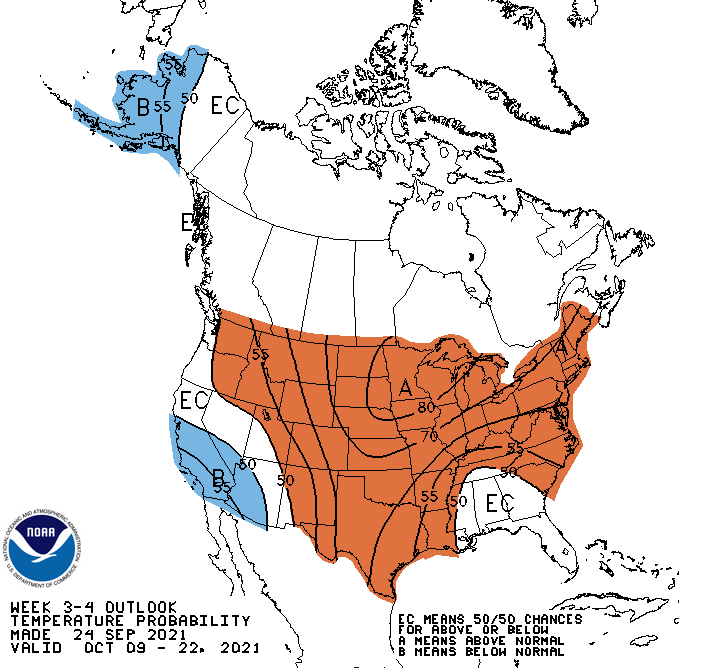
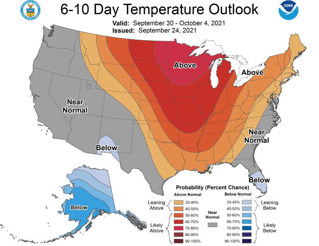
One source that I use pretty regularly here is the Climate Prediction Center. As the summer was winding to a conclusion, with many other weather news stories to cover, they quietly updated their forecast offerings. Now, it isn’t a massive change to their product offering, but it definitely is a fresh coat of paint.
This is one of those paint jobs that really makes things look considerably better, though. The CPC graciously still has a 3-4 week outlook with the old graphics.

Looks fine, I guess. Also looks like the middle of October could be warm. That’s neither here nor there, though. Let’s look at the 2 week forecast which is issued with the new graphics.

Now there is a key in the bottom, which is pretty great, and a full word or phrase for each section. Again, it’s warm in the middle of the country, but here with the new version of the map, it’s much clearer.
So this is definitely an improvement. They not only look better, but the information is a lot more clearly displayed than before. It’s nice to have an upgrade that is actually an upgrade!
